5 À SEC
strategy:
In order to maintain its leadership position and continue to recruit and build loyalty, while making its employees proud, the mission was to create the brand’s new identity and a new store concept, bringing a stronger image of quality and care.
solution:
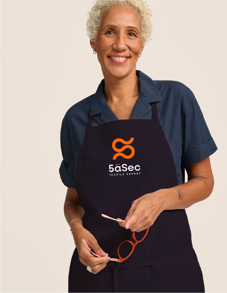
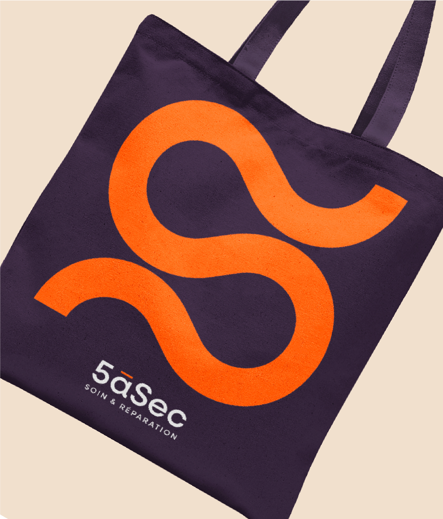
A new logo: a simple and accessible typography, the play of 3 colors: purple, orange and white, and the creation of a symbol, a real graphic landmark, inspired by thread and knitwear and reminiscent of the 5 and the S of 5àSec.
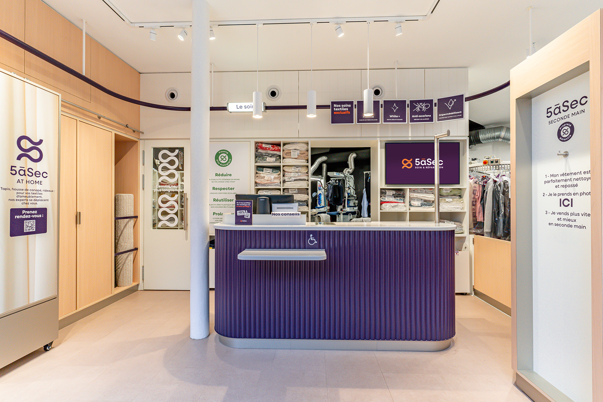
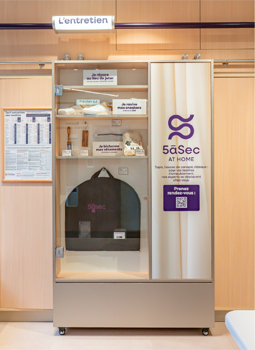
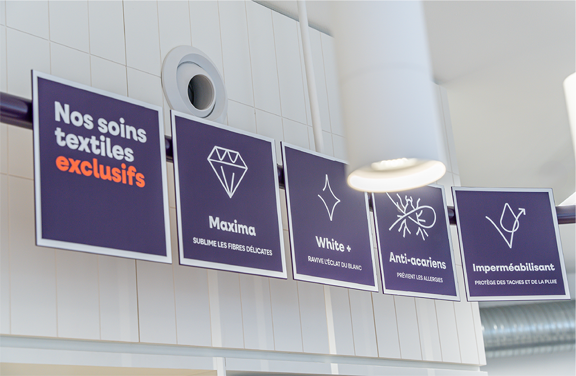
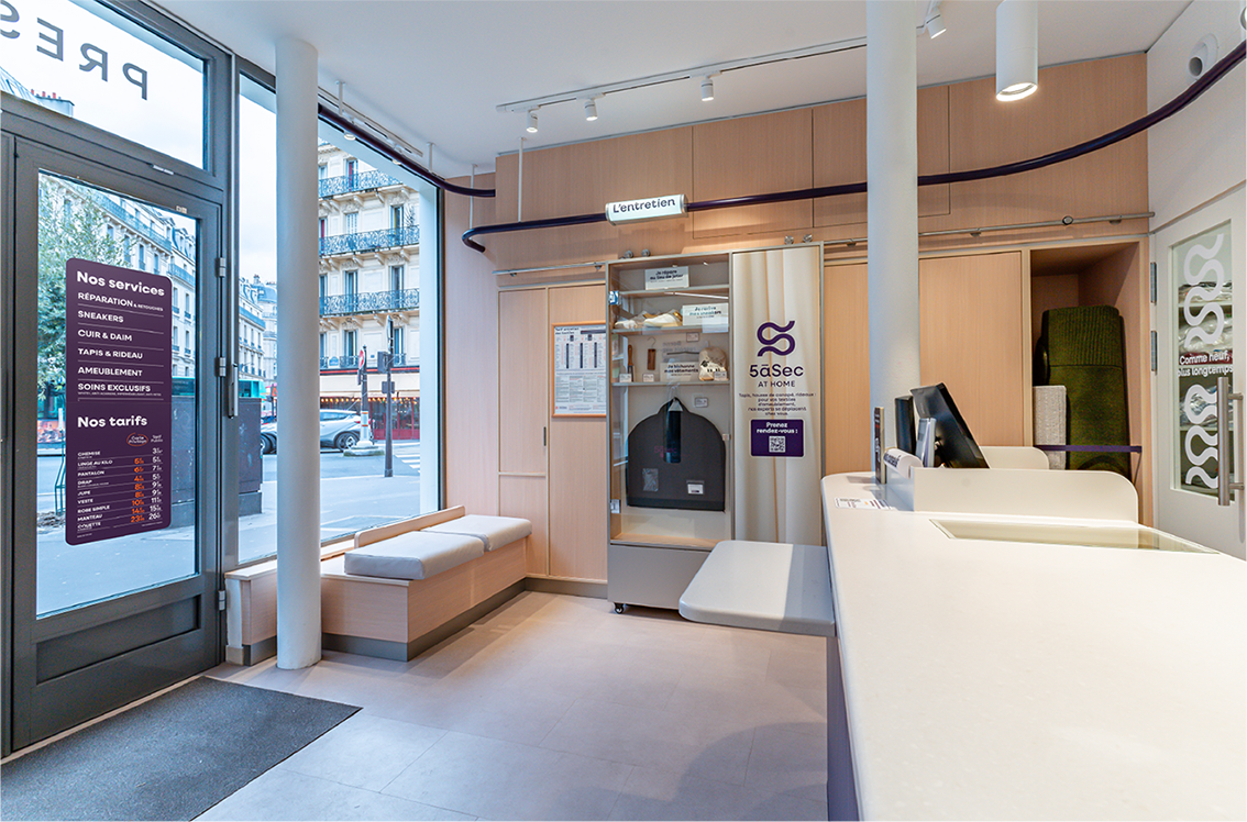
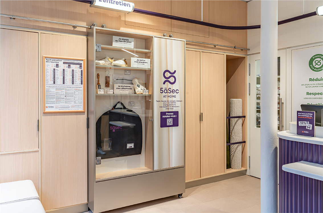
• A transformed customer welcome area with a more assertive care dimension. Like a “beauty institut for laundry”, the concept features warm tones of wood and white, soft, luminous lighting, and a signage system that highlights the brand's range of linen care products.
• A new customer experience allowing them to collect their cleaned and ironed clothes directly from a self-service kiosk.
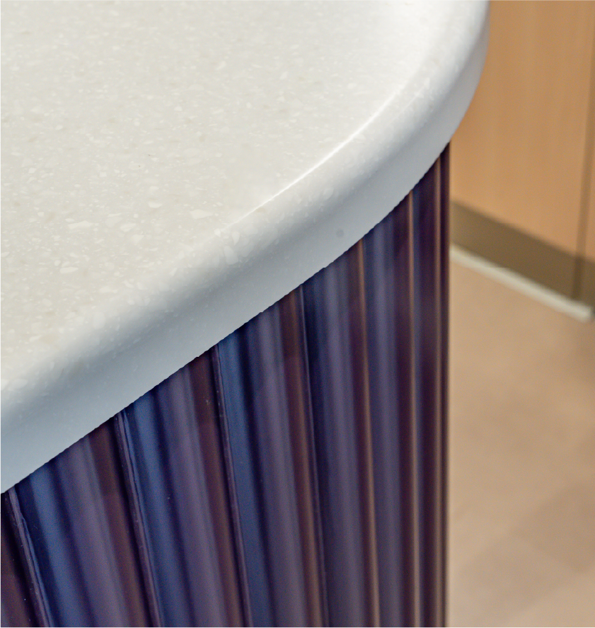
• The service counter is enhanced as the centerpiece of the concept,
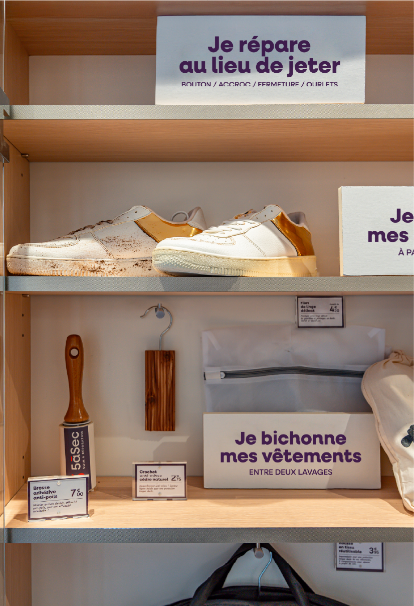
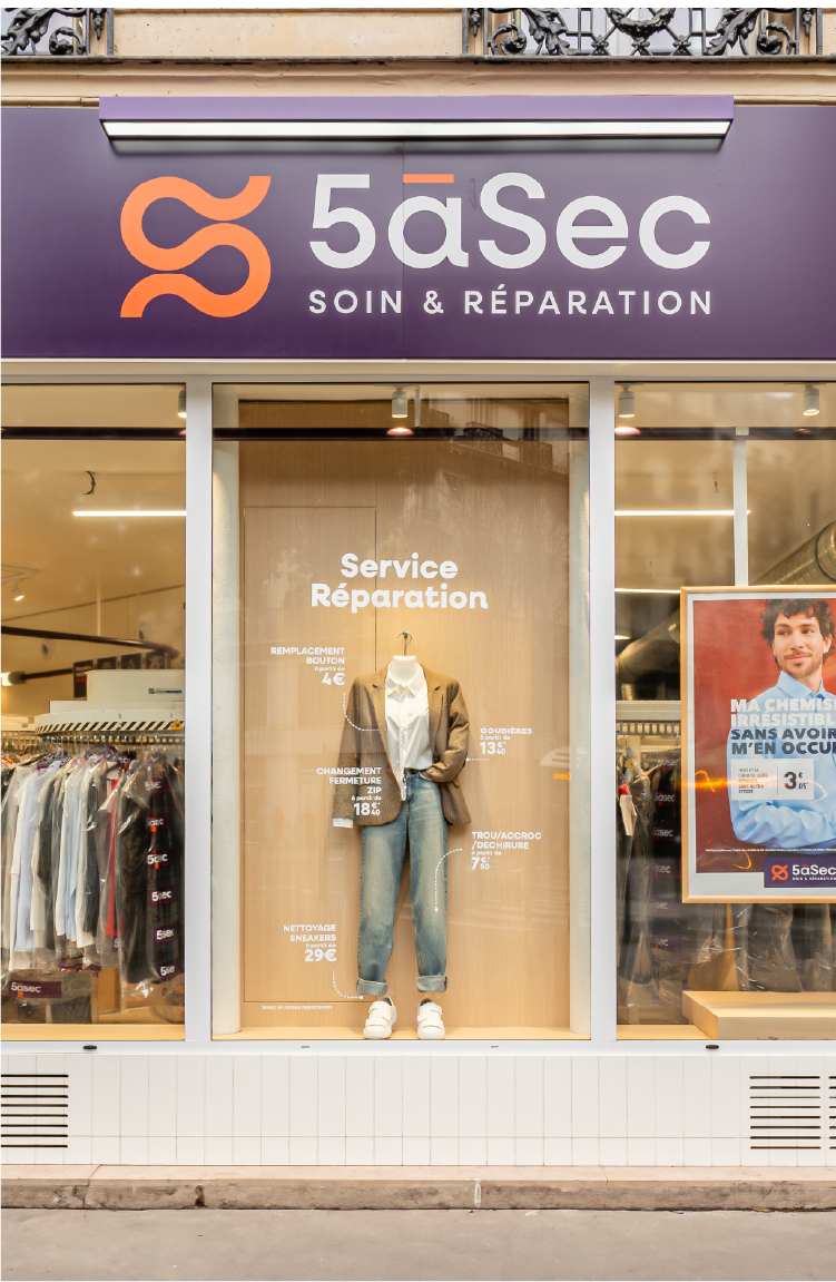
• A theatrical window display is used to showcase the Repair service.
• In-depth ergonomic design.
• A responsible design approach: eco-designed flooring materials, optimized lighting, refurbishment of existing facades.
expertise:
Strategy, branding, graphic territory, architectural concept, customer journey and experience, technical development, project management.
